Outstanding copy is the solution to gaining higher conversions.
But like so much of conversion optimization and digital marketing, outstanding copy is not easy to produce.
A lot of the writing advice that I read and study isn’t very helpful. It blows out huge lists of must-haves that I can’t keep track of. Plus, nearly every article on the subject has a long section raging about the importance of correctly-placed commas, and a million rules on hyphenation.
What?!
I’m not going there. Instead, I want to give you the four absolute essentials of high-converting copy. If you forget everything else that you read, don’t forget these four. If you can get these four characteristics in place, then you’re well on your way to producing high-converting copy.
1. High-converting copy is clear.
I’ve placed this characteristic at the top of the list, because it is the most important.
Be clear. Be as clear as you possibly can. Sacrifice everything for clarity.
Clear copy has the most compelling power. Clarity is more important than humor, more important than interest, more important than grammatical perfection, more important than anything.
I’m going to go out on a limb and say that high-converting copy might even be boring. Is that okay? Yes, it’s okay. Why? Because more than anything else, you need clarity.
Here’s why clarity is so important:
- Users need to understand what your product/service is. In order to tell them what it is, you need to have clear copy.
- Users need to understand what your product/service can do. A product’s features are a large part of why a customer is interested in the first place. You need to clearly explain each feature.
- Users need to understand the benefits of your products. The better benefits you have, the more likely you are to sell products. Product or services benefits are crucial. But if you can’t explain them clearly, you’re sunk.
Clarity is all about understanding. Users need to understand.
The only way that a user will be able to understand is if your copy is clear. Too often, I’ve seen people compromise what could otherwise be clear copy by trying to be cute, interesting, engaging, or whatever else.
Don’t even try. Instead, pursue clarity above all else. It’s conversions you’re after, not creativity or cuteness.
One way that you can be clear is by being specific.
2. High-converting copy is casual.
Creating casual copy sounds easy.
Just write the way you speak!
Use simple words!
Make it simple!
Be direct!
It sounds easy, but it’s actually pretty hard to do. Most people sit down, place their fingers on the keyboard, stare at the screen, and get all formal-sounding. It’s weird.
Maybe it’s a hangover from essay-writing college days or something.
We’ve got to learn to break away from the habit of stiff and formal writing. No one likes to read a landing page that sounds like an essay.
Perhaps one reason why people write in a formal style is because they think that they sound more competent, professional, or sophisticated. The problem is, big words and complex vocabulary don’t make you sound smarter.
In an article published in Applied Cognitive Psychology, researchers found a “negative relationship between complexity and judged intelligence.”
The researchers discovered that writers who used a complex style and vocabulary were judged to be less intelligent.
You won’t sound smarter by using big words and complex arguments. In fact, you might sound dumber.
Here are a few practical tips that will make your copy instantly more engaging and readable:
- It’s okay to break some grammatical rules. Like incomplete sentences.
- It’s okay to use contractions.
- Talk to the reader. Refer to them as “you.”
- Try dictating your copy rather than typing it. Pretend you’re telling a friend about your business and start talking.
- Use expressions, colloquialisms, or slang — “You know,” “It’s like,” “I’m thinking,” “What’s up with that?” “Gimme a break,” etc. Mild profanity might work for the right audience.
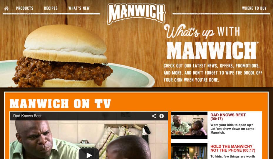
Manwich sends a macho vibe with their copy. It’s pretty casual.
People connect much better with copy that is conversational and casual. It’s way more appealing, engaging, and readable.
3. High-converting copy uses killer headlines.
The fact of Internet readers is that they scan for information. Very few users actually read an entire page from top to bottom. Instead, the user’s eyes flit from headline to headline.
80% of your page visitors will read the headline. It had better be good.
Headlines are important.
But why use only one headline? Why not break up your content with a bunch of headlines? As long as you space them out, size them appropriately, and back them up with great content, then you can use as many headlines as you want.
A headline, especially one that is short and succinct, has mind-bending powers. You notice it. You comprehend it. And it helps you convert.
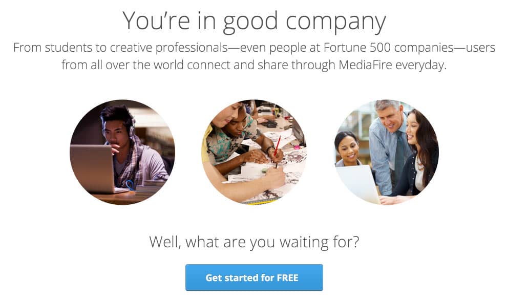
MediaFire’s parallax landing page has a headline for each section. It’s perfect for grabbing attention at every step of the way.
4. High-converting copy is scannable.
Good writers will create copy that is scannable. This is the longest section of this article, because I have to explain a few things. Scannable copy isn’t just about breaking things up visually. It’s about a whole approach to writing with its own set of characteristics.
It has short words.
People will choke on long words, skip over them, or drop to the next line when they see one.
Your big words will alienate your readers. Words that are more than three syllables or ten letters are tough to chew on. If there are some long words that are familiar to your audience, then go ahead with them.
For example “optimization” is a whopping twelve letters and five syllables, but it’s a familiar word in the SEO industry. That’s okay, as long as you’re speaking to an SEO-savvy audience.
But other than that, keep your words short and sweet.
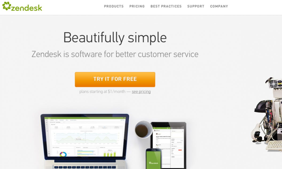
ZenDesk uses a brilliantly simple site design for their homepage. The longest word is “beautifully” and that’s pretty easy, as long words go.
It uses short sentences.
After a sentence crosses the 15 word line, readers tune out. Long sentences with lots of extra phrases are hard to digest. The most readable sentences have 10-15 words. This is the best structure: Subject – Verb – Direct Object.
You can even use non-sentences, or incomplete sentences to get your idea across.
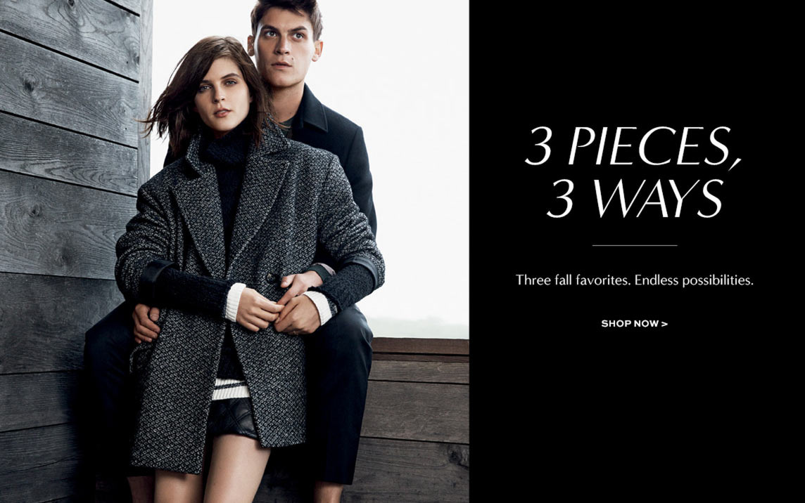
Banana Republic’s landing page has copy that is scanable at a glance. You immediately know what they’re saying, even though these aren’t technically complete sentences.
It contains plenty of visuals.
Pictures are just as important as words. The thing to keep in mind about images, however, is that they work in conjunction with visuals. Images and visuals are not two separate things. They have a remarkable symbiosis, greater than the sum of their parts.
Visuals are a natural way to break up your content into separate sections. The eyes can move from a copy block to a visual, giving them a “break.” Then, they can look back at the copy, back to an image, etc.
Copy that is punctuated by visuals is much more likely to have great conversion potential.
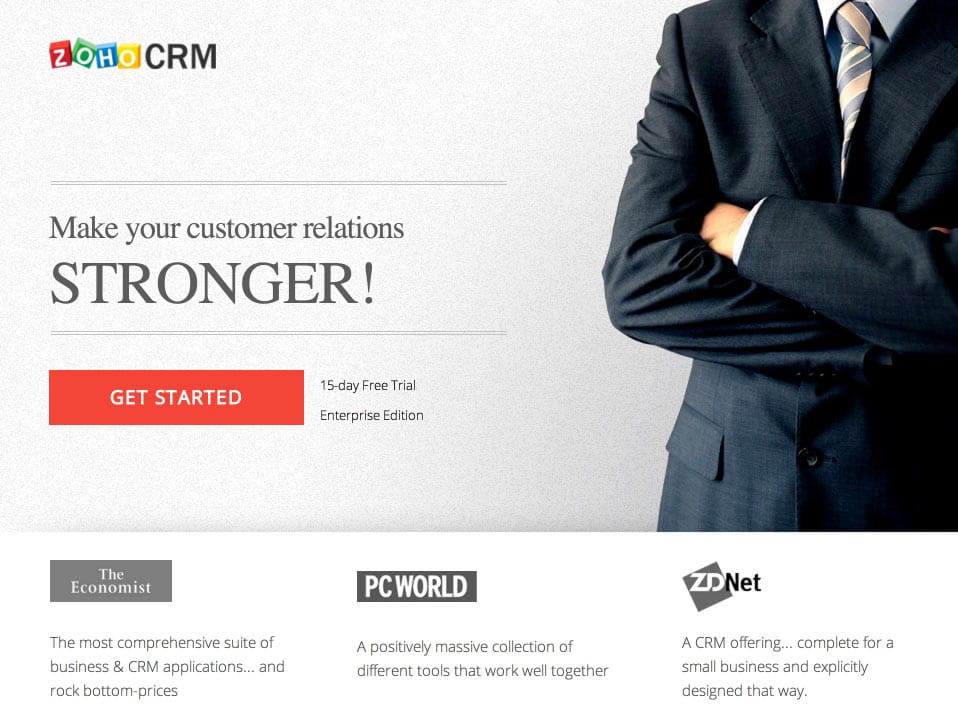
Zoho CRM’s landing page visuals to amplify their product. It’s hard to picture software, so they use this style of imagery instead:
It uses bullet points and numbered lists.
Here’s why you need to use bulleted points and numbered lists:
- They’re short
- They’re powerful.
- They’re direct.
- They’re easy to scan.
Plus, bullets and lists are easy to use just about anywhere.
It contains headlines and subheads.
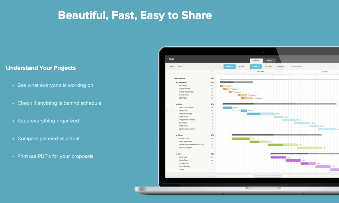
Big blocks of text grab attention. For example, when you look at this landing page for TeamGantt, you instantly see the headline, and the bulleted list.
The great thing about this particular landing page, though, is that it has tons of these sections — each starting off with a headline, a distinct background, and containing other subheads.
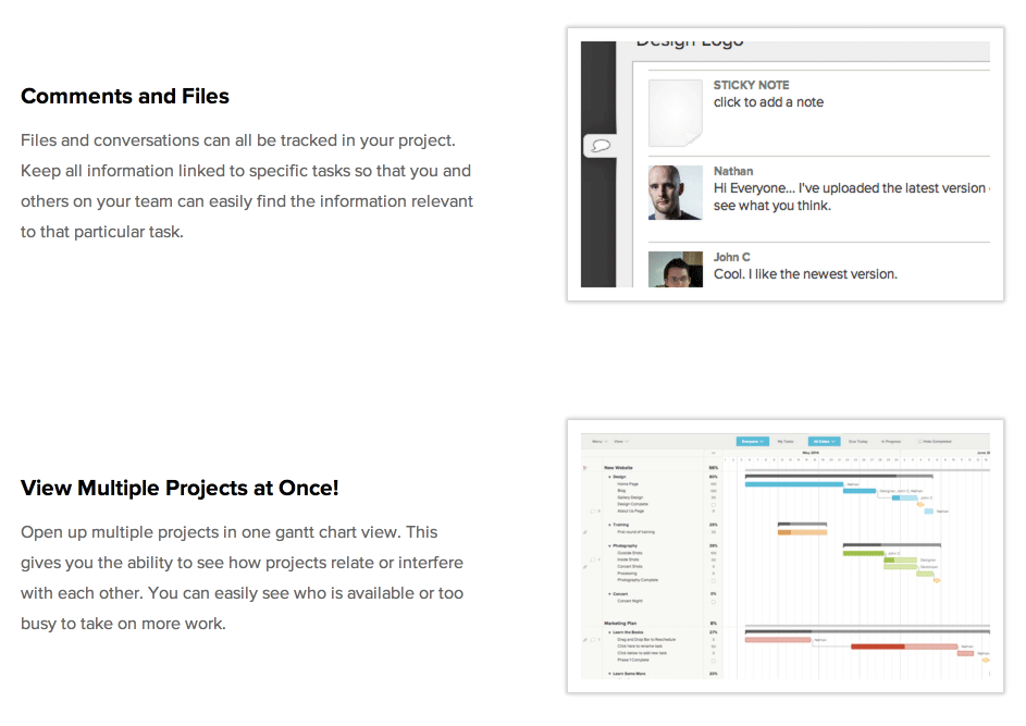
Here’s another section of the landing page:
Notice how the copy uses a bolded headline, an image, and a short blurb of text. For the readers who scan, they will instantly engage with the headline, and then move on. The more interested readers will probably spend time reading each paragraph.
It is broken up with plenty of white space.
The example above is a good example of the use of negative space. There’s lots of it.
There’s no magic ratio of white space to content. The main thing to keep in mind is that the user should be able to easily track the progress of the content. The more white space, the better.
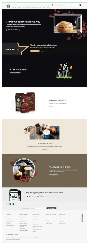
Notice how the landing page for Starbucks uses white space (even though it’s not white). White space drives your attention directly to the copy.
It uses the right words in the right places.
The fact that users scan means that they look at some words and not at others. For this reason, skilled copywriters use the most important words in just the right places.
- Use the most important words. Use words that will connect with a user on a deep and intuitive level. At the most obvious level, use the keywords that the user is expecting and/or looking for on the landing page. For example, if the user is looking for “coffee grinder,” then your page will contain those words. But you need to go a step further with this. If the user is looking for a coffee grinder, then they are also looking for other features: “Burr grinder,” “High-quality,” “Fast,” “Easy-to-use,” “Clean,” “Efficient,” “Safe,” “Guarantee,” “”Espresso grind,” “French press grind,” etc. These words are also very important, and need to be featured.
- Place these words in the right places. If the user is engaged, he or she will tend to see these words almost automatically. The brain can pick up on words and bring them to the front of our consciousness without our even trying. The reason for this is because the mind can visually perceive a word and its meaning in 1/300th of a second, according to a report from the Association for Psychological Science. The placement of these words on the page has a major impact on how this happens. As you go to create your copy, use these most important words in the following ways:
- Bold faced
- Italicized
- Underlined
- Highlighted
- Different colored
- At the beginning of the sentence
- At the end of a sentence
- In a headline
- In a bulleted list
- In a numbered list
Any one of these will make that word more visually important. That way, it will more easily grab the attention and interest of the reader.
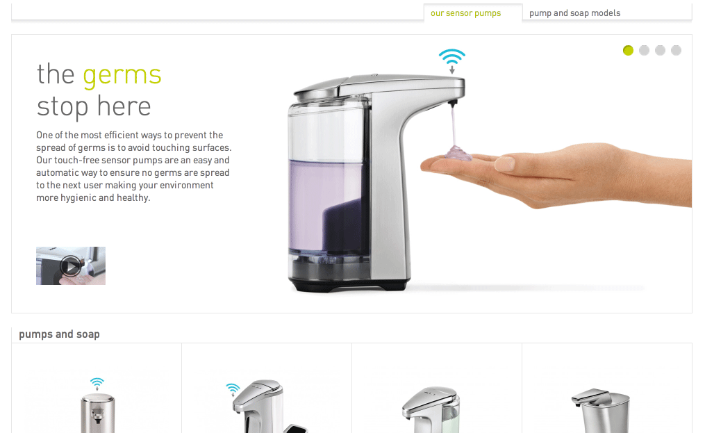
Simplehuman, a producer of household goods, uses a green font face to emphasize the word “germs” below.
CrazyEgg uses the same technique with their landing page. In order to emphasize their 30-day trial, this text is a different color.

Conclusion
If you can improve your copy, you can improve your conversions. It’s just that simple.
Writing better copy doesn’t have to be a complicated science or unattainable goal. You need to work towards these characteristics:
- Be clear.
- Be casual.
- Use awesome headlines.
- Make your copy scannable.
What changes will you be making to your copy?

Leave A Comment